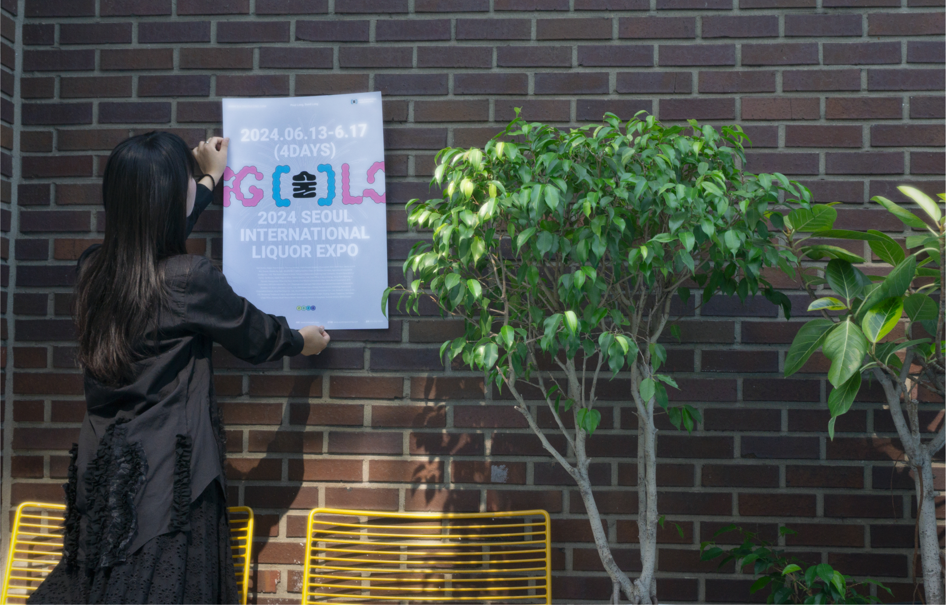
Soolong Soolong is a trendy liquor expo designed specifically to appeal to the younger generation. By infusing a youthful and energetic
vibe into every aspect,from its brand identity to its photography style, the expo creates an experience that feels fresh and modern. It seeks to break away from the conventions
of traditional expos, offering a distinctive charm and innovative approach that resonates with a contemporary audience,
making it a must-visit event for those looking for something new and exciting.
Since the COVID-19 pandemic, the demographics of liquor expo attendees have undergone significant changes. In the past, the primary participants were corporate buyers and middle-aged individuals. However, younger generations have now emerged as the main audience. This shift highlights the need to reimagine the identity of liquor expos.
This shift highlights the need to reimagine liquor expos to better resonate with younger audiences. By embracing modern trends, interactive experiences, and digital engagement, they can become vibrant platforms that celebrate contemporary drinking culture and create memorable, lifestyle-aligned experiences for the new generation.
Soolong Soolong reflects the multifaceted essence of its name, capturing the core and atmosphere of the expo. The name embodies the experience of savoring drinks over time, the bonds formed through shared moments with alcohol, and the lively, cheerful vibe that comes with enjoying it.
LOGO
The logo is composed of softly interconnected small circles, symbolizing the bonds formed between people over drinks while capturing the gentle, swaying sensation of being tipsy. Each circle represents diversity and inclusivity, reflecting the unique connections that emerge in social settings. Designed with versatility in mind, the logo also serves as a dynamic graphic motif, adaptable across various applications to convey its meaning with warmth and creativity.
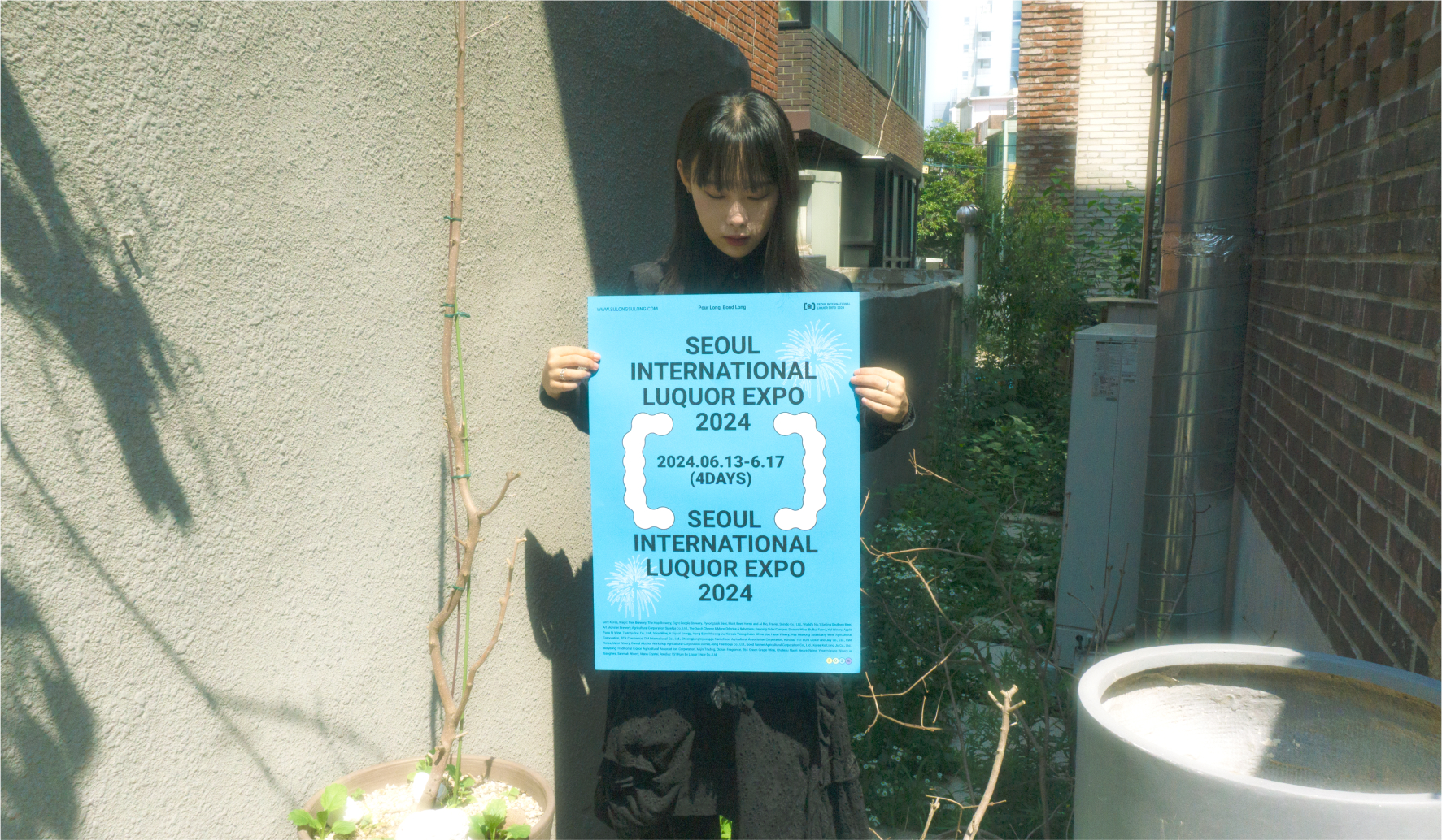

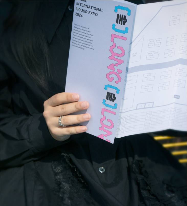
The color palette reflects the vibrant and dynamic nature of the expo, utilizing a variety of hues. Blue and pink convey
a dreamy yet joyful atmosphere, reminiscent of being tipsy, while emphasizing the sensory and unique vibe of the event. Gray is added to
balance the vibrant colors, lending a sophisticated and composed touch to the overall design.
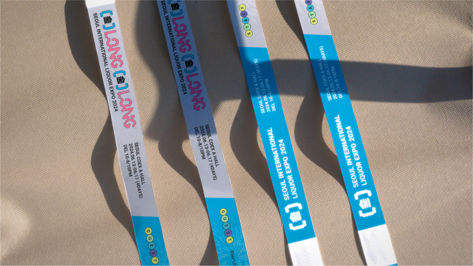
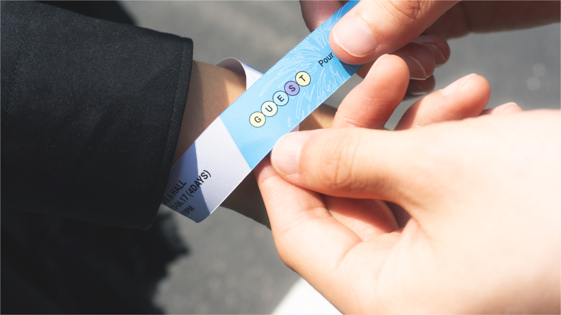
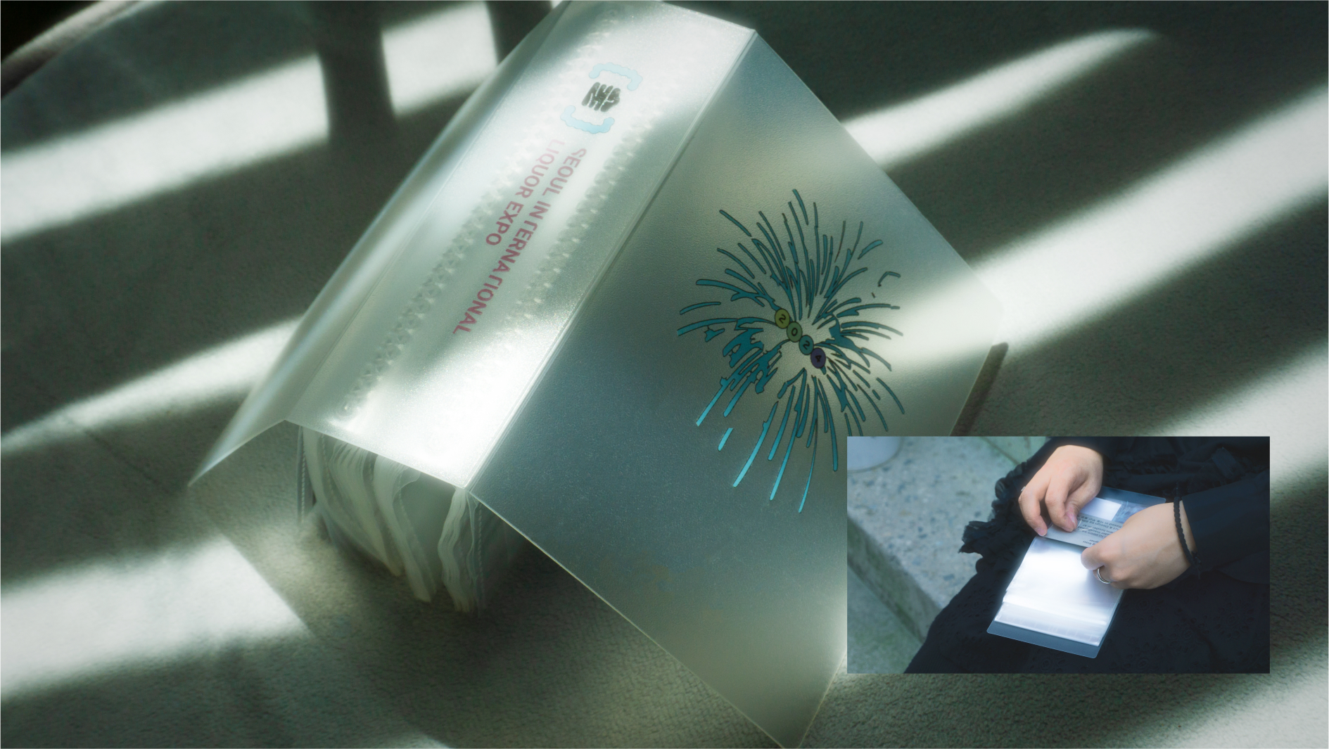
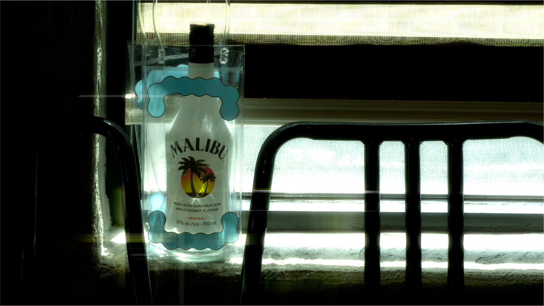
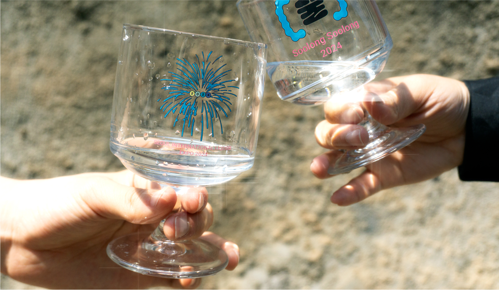
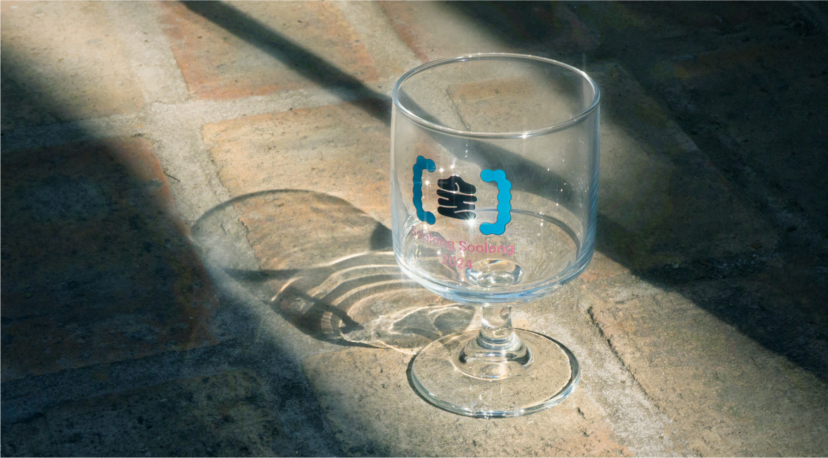
I created a range of merchandise to suit various situations, ensuring practicality and aesthetic appeal. This collection includes chilling bags to keep drinks cool, stylish glasses for enjoying beverages, convenient wristband tickets for seamless entry, sleek cardholders for easy organization, and personalized name tags for identification. Each item was thoughtfully designed to enhance the overall experience.
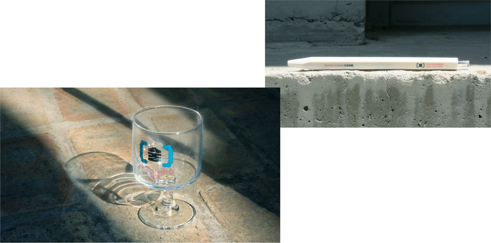
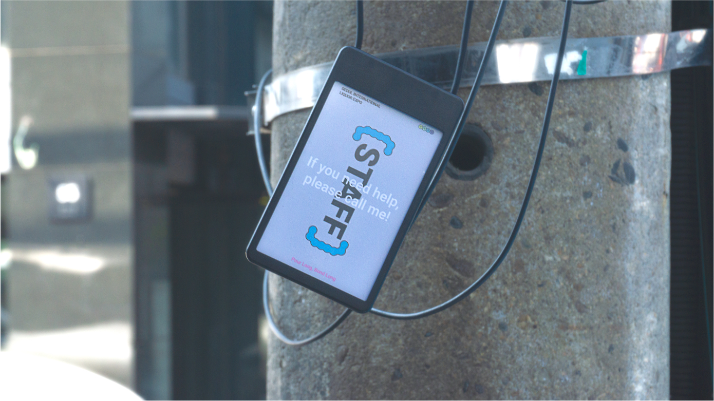
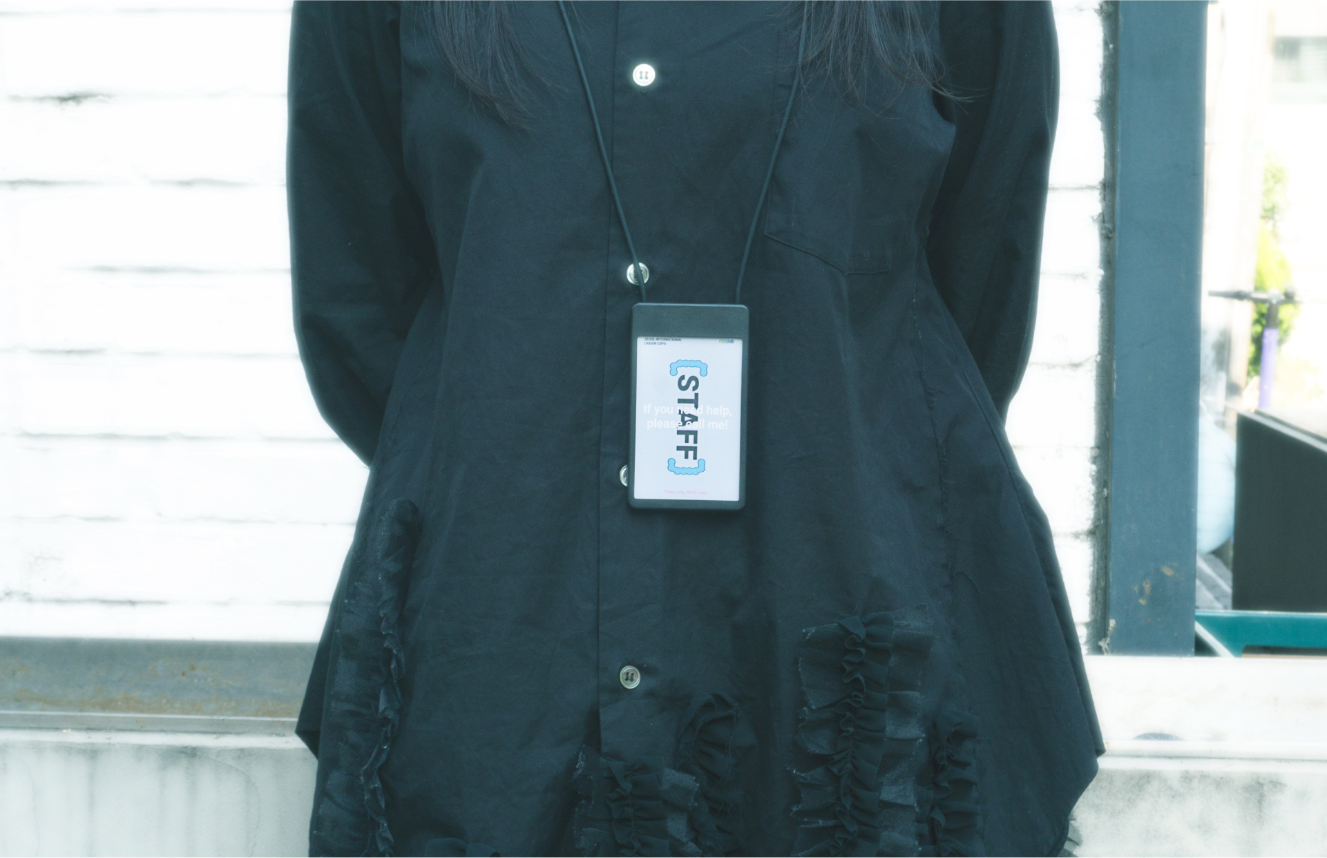
The brand photography draws inspiration from the style of Yoshiyuki Okuyama, featuring bright, radiant, and dramatic imagery. Okuyama's work excels at capturing the textures of transparent objects, and this technique enhances the brand's unique sensibility while conveying a trendy and modern image.
Noji 105
Category
Duration
Tools
Contribution
Branding
2024.04.15-2024.06.18
Illustrator, Photoshop, Indesign
100%

